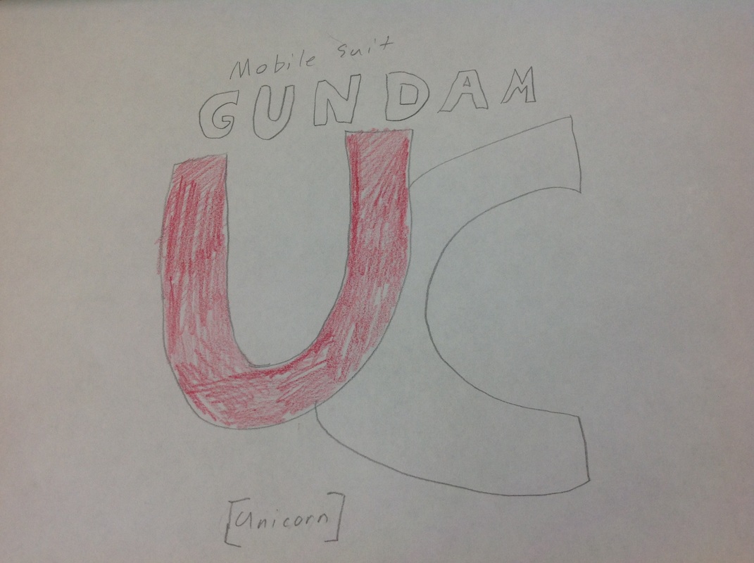
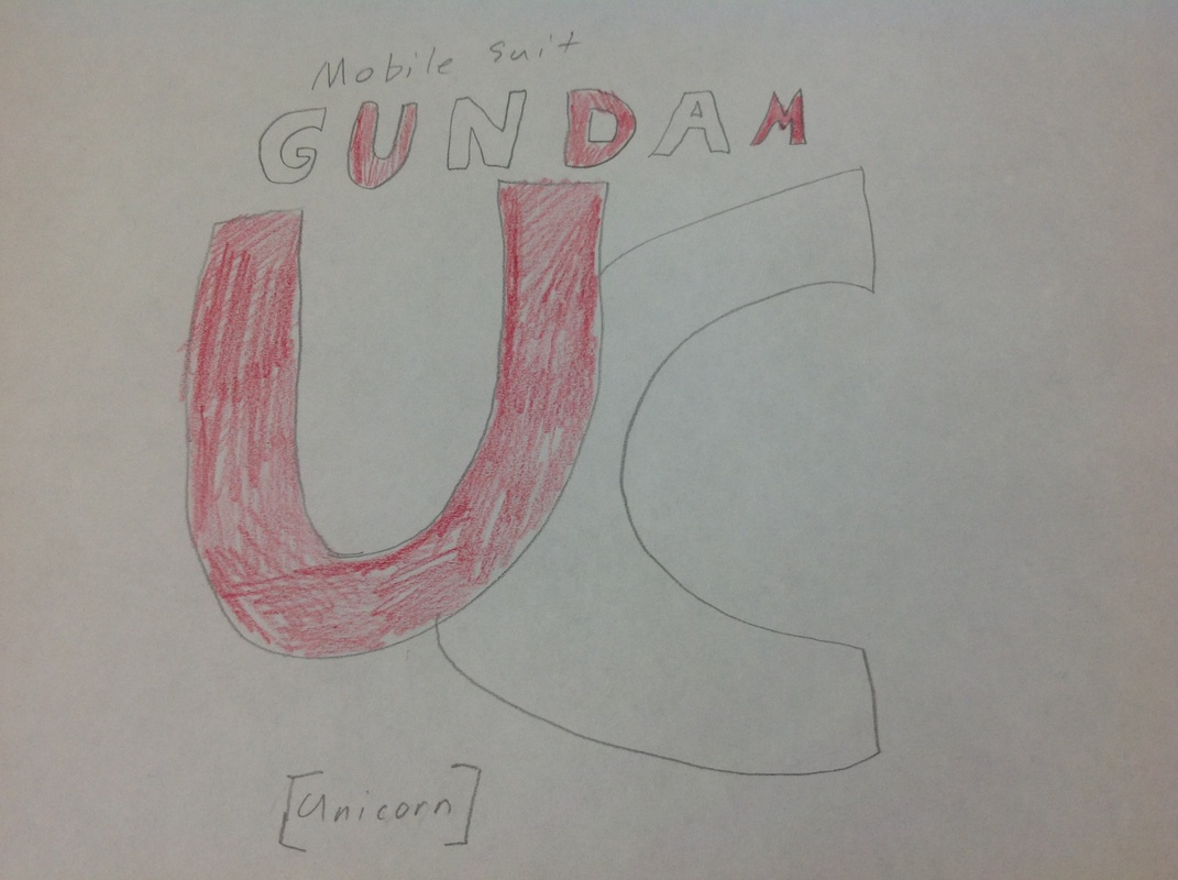
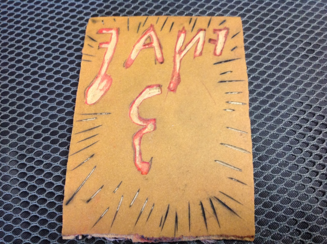
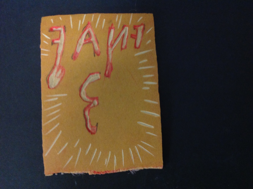
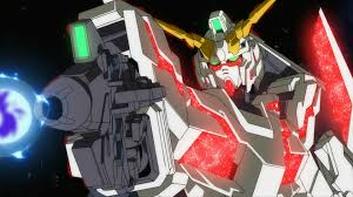
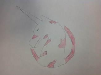
These are the 2 drawings that I made, they are from the Gundam anime that i like so much but this one is in another timeline. The anime is called Mobile Suit Gundam Unicorn. the main suit is called the Unicorn, it has two modes Destroy and Unicorn and the Destroy mode is the first photo. I based my first drawing off of that, it's the Unicorn logo and i made it to look like it was opened into Destroy mode. the second drawing is a hand drawn "logo" that i came up with, it's in the colors of Destroy mode. All I used was paper and pencils, for the first one i traced the outline of the real one. I colored it like it was opened. If I was to change something about this project I would add more color to it so it would look a little better. I think that they turned out pretty well. T would also add the Japanese characters of the title scene to the logo. These two drawings bring me up to exactly 50,000 points!
this is the first part of a project that I am doing. It's a stop motion build of a Bandai model kit called the Real Grade Strike Freedom Gundam from Mobile Suit Gundam Seed Destiny. The video is short because the photos go by very fast. This project has a point system and for this one it counts as 30,000. The person that I am photographed with is my best friend Sierra, she's one of the coolest people that I have ever met. She's funny and kind, and we have a lot of fun at school. We laugh A LOT together especially with my Frenemy Gabe. I think that how the landscape picture that I used reflects me by how it's nice and calm like me in most classes but when I am talking I am pretty fun. I chose to do all of her because that's really all I can do. Because I took a kind of a selfie with her instead of a full photo.
This is my printmaking project I decide that I would do a version of my own of a "logo" of a video game I like to play. the game's called Five Nights At Freddy's, it"s a horror game.
what I like about mine is that a few of the prints kind of messed up with the black ink and made the letters look like they were filling up with blood and gave it a nice effect like the first photo. I have some process photos of what the half finished product look like and finished product. I think that it turned out pretty well i hope you all like it!!!! Thanks and catch ya later!!! This is my design for a Dirty Dog Advertisement. Since to me they seem like a really confident, American restaurant/bar I went with some red and blue for some neat borders for that American feel. Then I went with a nice juicy burger and some french fries with some ketchup just to make people hungry to go there and some food and a couple of drinks. What I like about my design is that it's very neat and organized i think that it turned out very well. One of my best so far!
|
About The SiteIt will just have posts about art projects that I am doing in school. So I won't be doing anything to in-depth. Archives
May 2015
Categories |