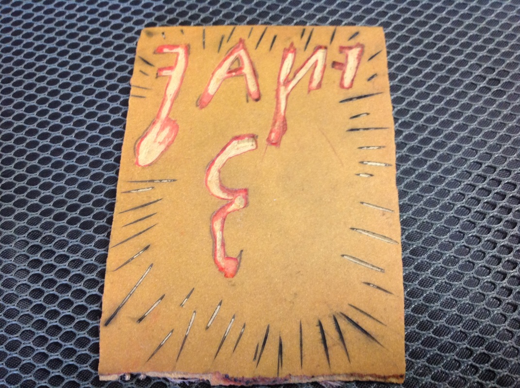
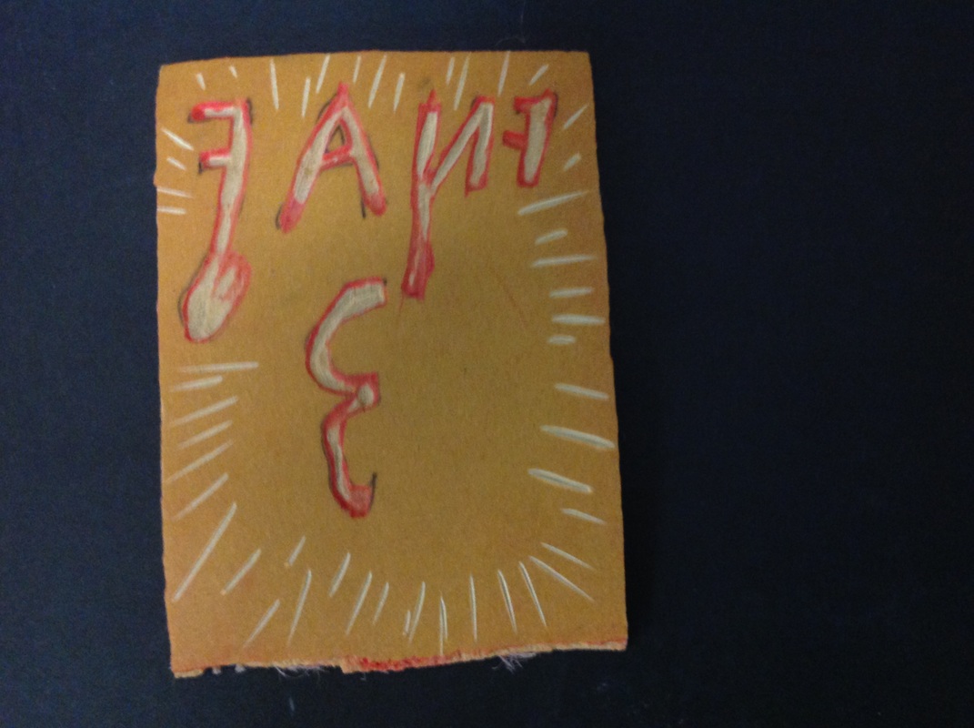
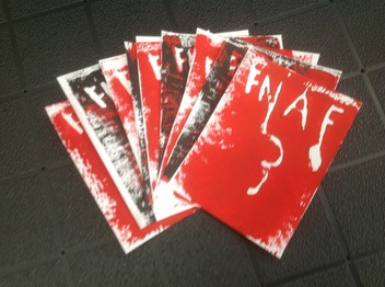
This is my printmaking project I decide that I would do a version of my own of a "logo" of a video game I like to play. the game's called Five Nights At Freddy's, it"s a horror game.
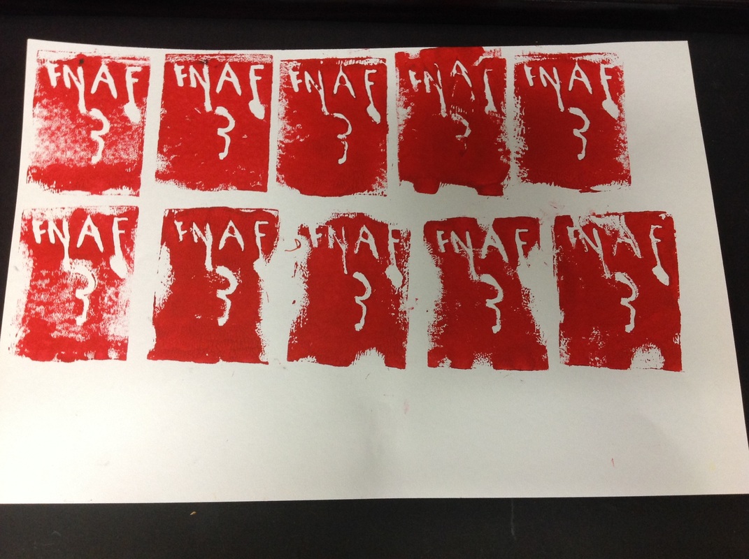
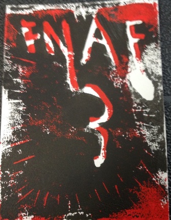
what I like about mine is that a few of the prints kind of messed up with the black ink and made the letters look like they were filling up with blood and gave it a nice effect like the first photo. I have some process photos of what the half finished product look like and finished product. I think that it turned out pretty well i hope you all like it!!!! Thanks and catch ya later!!!
what I like about mine is that a few of the prints kind of messed up with the black ink and made the letters look like they were filling up with blood and gave it a nice effect like the first photo. I have some process photos of what the half finished product look like and finished product. I think that it turned out pretty well i hope you all like it!!!! Thanks and catch ya later!!!
